Monday 7 December 2009

Master Pages

This is screenshot of my master pages that I created in InDesign, a master page is a publishing term for a template, I have set these up so now every page I create for my newspaper will already have this information and design on.

As you can see below, I have the title of the newspaper (SpEEC) printed aswell as the date in the outside top corner of the page then I have created a thin blue stroke going across each page at the top to separate the title and date from the news and then in the bottom outer corners of each page I have taken the college logo (the red shape) and created it into a page number image, where each page number will be present on top. This shows the college being involved, additionally, the red and blue combination of this page represent the colleges house style colours.
For the front page I have added the newspaper logo, date, price, a stroke and a footer on the master page as this will be on every front page and always in the same place as you can see directly below.


House Style Newspaper Font

Below is a print screen of my font style template that i created in InDesign, as you can see the headings for my newspaper will be in Helvetica Neue, the sub-headings in Prestige Elite Std and the body text in Century.


Although my newspaper is going to be a college parody I have still chosen typical newspaper fonts as I don't want to challenge the font conventions of a newspaper as I need the students to still be able to read it easily. So from my research I have realised these fonts are pretty common among newspapers, especially the heading and body text I chose which are of the most importance, for the sub-headings I have challenged it a little as i felt my newspaper still need to have edge and look contemporary to relate to the students, so instead of having modern text or typical newspaper font I have gone a different route and gone for a type-writing style which holds connotations of old style writing and publishing.

New Newspaper Title, developed and final!

The logo above I designed through developing my sketches and I was sure it looked good for a newspaper logo/title however when I showed it to peers and my tutor they said it doesn't look very strong so after a lot of work and development I designed the one below which got much better feedback so below is my completed, final logo!

Monday 30 November 2009

Newspaper Typography

Before I redesign my new title I'm firstly going to research newspaper typography and newspaper fonts so I will be able to see if there is an obvious choice for my newspaper flag, headlines and body text.


The diagram above shows all the technical terms of typography. These have given me a more in-depth understanding of letters and words and how they are presented. This is again shown below in another image with a few extra terms.
Below is another example of some typography terms but has also mentioned the technical terms of spacing.


Above Sans Serif and Serif font is mentioned, below is a diagram showing the differences between them.


As you can see Serifs on a font are informally called the 'feet' on the letter.

From finding these images they have helped me get a better grasp on typography and will hopefully help me in considering my fonts for my newspaper.

While Researching I came across this image and study below, which has really enlightened me and I didn't realise before a newspaper would use so many fonts!


This copy of a local Los Angeles newspaper shows 22 different fonts and typefaces on the front cover alone!


The link above will direct you to a Font study which states that Poynter, Franklin Gothic, Helvetica, Utopia, Times New Roman, Nimrod, Century, Interstate, Bureau Grotesque and Miller are the most popular typefaces in newspapers.

Thursday 19 November 2009

SnEEC to SpEEC

After talking to peers about my newspaper idea, together we came up with a more relevant name 'SpEEC' which obviously relates better to the idea of a newspaper better than SnEEC so i have now officially changed the name!
But unfortunately now have to go through the design period again!

Computer Generated Ideas

I've taken the ideas from my drawings and developed them using Photoshop. As you can see below i have gone for four main ideas for "SnEEC"

1. School Writing:


These three ideas are all very similar and i have created these to emphasize the college audience and theme of the newspaper.

2. Stereotypical Newspaper font:


This example is a typical convention of a newspaper and this is why I have chosen this, I think if I choose this idea I will later develop it further to become more of a parody typestyle to emphasize the genre.

3. College-Themed writing:


The above two are typical American high-school writing and I believe this will also emphasize the college audience.

4. Accentuating the 'n'


I think this is a good idea of accentuating the 'n' and i will definately be doing this in my final design however i don't think i'll be picking any of these designs.


* Please ignore the red background

Monday 16 November 2009

Possible newspaper names and paper development

First, I am going to think up some possible newspaper names and then draw them out or create them with different fonts and logos/images.
  • pepper
  • play
  • play-on
  • SnEEC
  • SnEECy

After re-evaluating these names and before I started drawing I had already cut the list to:

  • pepper
  • play
  • SnEEC

as I much prefer these three, so I am now going to do some rough drawings of these names, pick one that I like the most and then transform that one onto a computer to be my newspaper title.


After creating some drawings (above) I then added some colour (below) but now can't decide between the vertical Pepper title and the majority of the SnEEC titles, so I am going to computerise them both and perhaps experiment and see what the outcome is.
* please note: the vertical pepper title isn't going to be vertical if it is chosen, only place I could fit it on the page, so it is infact supposed to be horizontal and will be if chosen.

Parody newspapers

As I aforementioned there is a huge gap in the market for parody newspapers, and when I went to research them I could only find this one in America, called 'the ONION', so I have now made a definate decision to make a parody type newspaper as we definately need one here!

I found the below newspaper very humorous and I believe the students of SEEC will too, below I have researched what the typical features are of this newspaper which has given me a better idea of what to include in my own.

the ONION


If you can't read that small font i have written out what the text actually says on a previous front cover of the ONION to give a clear idea of this newspaper. This was published in 1994.

"BEER! It Kicks Ass!

September 10, 1994: Beer! Beer! Beer! Whoooooooo! Beer! It kicks ass! Whooo! Beer! Beer! It's so f**kin awesome! Beer! Drink some beer! Beer! Beer! Beer! Beer! Beer! Whoooo! All right! Beer! Beer! Beer! Whooooo! Drinkin beer on a Saturday night! Whoooooo! Beer! Beer! Beer! Beer! Mother-f**kin beer, man! Beer! Beer! Gotta drink some beer! Beer! Whooooo! Gimme a goddamn beer! Beer, man, beer! Beer! Beer! Whoooooo! Yeah! Beer! Go team! Beer! Beer! Drinkin beer! All night! Beer! Beer! Beer! Beer! Beer! Beer! Beer! Beer! Beer! Beer!"


the ONION includes articles on current affairs and events, both real and imagined. It's a prime example of a parody of a traditional newspaper with features, such as editorials, man-on-the-street interviews, horoscopes etc. Much of its humor depends on presenting everyday events as newsworthy items, and by playing on commonly used phrases, as in the headline, "Drugs Win Drug War." - which is another example of a headline on a previous print. It additionally features interviews and reviews of newly released media. It also contains restaurant reviews and previews of upcoming live entertainment specific to where it is distributed which i also aim to do. I think i will take this idea and transform it to a Southend/Essex/College version.

Thursday 5 November 2009

Statement of Intent

From researching existing newspapers, I soon realised there was a huge gap in the market for a parody newspaper and this is why i have decided to create a local one. I am going to aim the newspaper at the students of South East Essex College as they are missing a college newspaper to inform the students (and maybe some teachers and parents) of what is going on in and around the college. I think a parody newspaper will be very appealing -to the students especially- and they will enjoy reading it, and hopefully get rid of the conventions of the news and newspapers being "boring" and dull. This will be a huge contrast to the current local newspapers and because of this I am sure it will be very popular as I believe the students need something like this.
I have decided that the style of my newspaper is going to be a traditional looking newspaper with a modern and humourous edge!
I am now going to research parody newspapers to give me a better idea of what to include in my newspaper and look at the layout and how they appeal to their audience.

Below I have created deadlines for myself to make sure my project is complete.

Diary of Dates:

Tuesday 3 November 2009

Newspaper over the years

Through Google Images I have found three different images of a local New York paper; The New York Times, and I am going to analyse theses to see how it has changed over 100years.


26.06.1906


11.11.1918


19.07.2009


My initial thought from looking at these images is the decrease of writing and increase of blank space, images and adverts over the years. This shows me that if I am going to create a contemporary newspaper I need a lot of images in ratio to the text whereas if Icreate an old newspaper then i will have to produce more text.
Pictures seem to have a better effect when catching peoples eye over just the headline, this shows me I need a lot of colour and images to appeal to todays audiences as this is a common theme in todays newspapers.

Monday 2 November 2009

Social Class

I found this table at www.wikipedia.org while i was researching social class to get a better understanding of who newspapers are aimed at. This will help me throughout my project to know who to aim my newspaper at and to get a better understanding of the audience.

A - Upper Middle Class - Higher managerial, administrative or professional
B - Middle Class - Intermediate managerial, administrative or professional
C1 - Lower Middle Class - Supervisory or clerical and junior managerial, administrative or professional
C2 - Skilled Working Class - Skilled manual worker
D - Working Class - Semi and unskilled manual worker
E - Those at the lowest level of subsistence - Casual or lowest grade worker, pensioners and others who depend on welfare state for their income

Monday 28 September 2009

Researching National Newspapers

Again, i have scanned in a front cover and two inside pages of a few newspapers, however this time i am going to analyse national newspapers to see any comparisons or contrasts with local newspapers that i need to take note of.


The Sun


My initial thought of The Sun newspaper is that it is very colourful and opinionated; as you can see on the left hand page they are criticising Victoria Beckhams coat and it seems that is all they are interesting in, humiliating her as they don't acknowledge she is there for a charity event. Furthermore on the right hand page they have photoshopped a picture of Tony Blair to turn him into a devil with flames in the background which also indicates the newspaper is very right wing and the use of the rhetorical question above him also suggests the newspaper knows there audience very well, they know what the audience would answer to that and are addressing them very well. This shows the people that are likely to buy the sun are also right wing. There doesn't seem to be much of a house style to this newspaper apart from headlines that take up the majority of the page and a lot of colour to stimulate and attract the reader. Additionally; The Sun seems to use humour to relate to their audience with examples from the Tony Blair picture and the Gordon Brown story on the cover. The Suns political views are very obvious and is a very strong theme throughout the newspaper. This is a very busy newspaper, it seems that if there is any space left over on a page layout they will try and cram a small 'snippet' of a story in the gap.
The quality of the newspaper is very low and it is aimed at lower class, this is shown as it's very colourful, it has a busy look and it is very bias.


The Independent


This newspaper looks very high end, it has a very professional look to it and is very elegant, this show the good quality of the newspaper and the higher social class audience, in comparison to The Sun. The flag looks very traditional and the whole layout of the newspaper is neat and consistent. The Independent seems to be right wing and bias too, the front cover is all about the expense scandal and has three 'mug shots' of three MP's. The similarity to The Sun is that The Independent also knows its audience very well as it also uses a rhetorical question heading to relate to the audience as they know the audience they appeal to shares the same views, especially in politics and this is how newspapers such as The Sun and The Independent can be so opinionated. The majority of the inside pages have been taken up with columns of text which shows the consumers of this newspaper are more than happy to sit and read long columns of text and not flick through which is in contrast the the local newspapers i annotated. The house style is subtle but the deep red is present and the photos are very neat and are full pictures which haven't been cropped of photoshopped which just adds to the sophistication of this newspaper. Furthermore the use of a drop cap at the beginning of the story justifies this point further.


Independent Life


The Independant life paper is a small paper which is inside of the main Independant newspaper. Immediately you can tell this is more of a high end paper as the text to photo ratio is much higher, although there is quite a few pictures which are fairly large, because there is so much text that fills all of the space it balances it out. Additionally, there isn't one advertisement on those two pages which also suggests it's in the higher end market. This pull out newspaper is in keep with the main Independents house-style.


The Daily Mail


The Daily Mail is another national newspaper, it is very different from the Independent and shares a lot of similarities with The Sun, however i think it is slightly higher quality than The Sun. The headings are all very large and bold to stand out, however within different stories The Daily Mail has used different fonts, this is very unusual and makes the newspaper look unprofessional, with addition to this, there are a lot of pictures and adverts which lowers the quality of the newspaper and makes it look a little busy. The front cover of the paper is split in two, one half is a large advert and the other half is a very big heading, this may have been done to grab the readers attention with the colourful advert and large text.

Terminology

While I was researching newspaper terminology I came across this annotated picture from TheTimesOnline which is going to help me as i will be able to look back and refer to this.


Additionally, to make sure I get to grips with the terminology I have below annotated a few newspaper clippings to show some of the terms so i can later refer back to them to help me. I have used a mixture of terms from the glossaries at these websites:
http://highered.mcgraw-hill.com/sites/0072407611/student_view0/glossary.html
and
http://www.jsprinting.org/glossary/


METRO or any newspaper title is called the flag

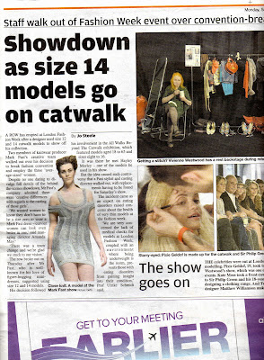
The short snippets of news down the left hand side are called fillers

A headline which is placed either to the left or the right, like above, is called a side saddle head

The text within the main story on the front page has been justified to look neat as all the edges line up

The small text underneath the photo is called a cutline and at the end of the cutline it says >P9 and this is called the jumpline, as it is telling the reader where the rest of the story is.


At the very bottom of this paper there was a long strip of advertisement for a free public seminar, this is called a banner ad


What i have highlighed above is the text underneath the three photos, which are called captions


The box i have drawn above shows the editors, photographers and any contact info etc. This is called the masthead and is often on the inside page of the front cover, which is where i found this one.

Tuesday 22 September 2009

Reseaching Local Newspapers

Below i have scanned in pictures of local newspapers to analyse them, for each newspaper their is a front cover and two inside pages.

London Lite


The first thing i notice about the London Lite is that it is very colourful, the flag and the headings are all in colour, and all different colours too - pink, yellow, black and white - this emphasizes that it is a low end paper. This is also justified because it is free. However the colour could have been used to show that the paper is contemporary.

There isn't much 'story' text on the front cover either, around 80 words, this shows the picture:text ratio is very high. This is also shown in the two inside pages where there are a lot of pictures spread around, additionally; because the pictures aren't full pictures but have been photoshopped and cropped, to cut out the background, shows the cheap quality of the newspaper. It looks very busy and tries to grab your attention to different parts of the page. Furthermore this layout shows the newspaper is more of a 'flick through' paper, where the reader just flicks through reading a few snippets and small stories but doesnt take much interest. The reason behind this could be that the editors know their main audience are people in/around London and especially people travelling on trains as it is well known that this paper aswell as the METRO are left on trains for the next reader, this is how their newspaper gets so much coverage and a very wide audience.


The Echo


This other local paper, The Evening Echo, also has a high picture:text ratio, as you can see the pictures are very large aswell, taking up the majority of the page, however this is a double spread story so there's also a lot of columns of text; although these have been cut up to smaller subjects with sub headings within the story so the reader can go to the part that interests them, instead of reading the whole story. This paper on the other hand, has full pictures, which shows a bit more quality then the London Lite but still looks very busy. This could be because it isn't a free paper so has to show some more sophistication, but is still on a small scale as it is only a local paper.

This newspaper is aimed at people from Basildon and surronding areas so the stories discussed in the paper are just related to these residents. Apart from the flag and headline on the cover there isn't much colour throughout this newspaper as I believe it is trying to show professionalism inside to make it a trustworthy source however the front cover shows me that they're trying to make it contemporary.


London Evening Standard


The London Evening Standard is another local paper, there isn't much colour at first glance of the front cover, except the two yellow strips that have been elegantly used to seperate the flag to the story and then again form the story to the adverts. This is a very smart, yet contemporary look for a local paper. Although, when you open the newspaper, it is a different look, it is colourful, with a very large picture nearly taking up the majority of the right hand page and the left hand page sectioned to many different topics; weather, news and contact information. Both the pages looks very busy in comparison to the front cover. On the other hand, as you look closer you can see the house style which is very consistent throughout the newspaper. The yellow strips and house colour, all the text is in the same font, all the headings/subheadings are all bold and the every picture has a thin border, combining all of this, it look very professional.
The reason I believe they have given the newspaper this look is to relate to their audience who are the London business people also it is released at a time when they have finished work.

METRO


Just from looking at these three pages, I believe the METRO is more of a low end newspaper; the layout on the front cover is trying to cover as much 'snippets' of news as possible so people pick it up, the METRO is free which is also an indication of this, looking through the paper, with an example above, the majority of he right hand side pages are advertisements, if not the full page, normally about three quarters full. There are big or bold titles and headlines and on the front cover some are in colour too which doesn't show high end quality. The METRO is being portrayed as quite a contemporary paper this is because of the coloured headlines and titles, also their date and website are vertical which is edgy and different.
The audience for this newspaper is the same as the London Lite.