Tuesday, 9 March 2010

Website Layout Designs

The three sketches below are layout ideas for my newspaper website.
Key:
Rectangle/Squares = Photographs
Lines = Text

1. This design I have the logo at the very top of the page with the navigation bar underneath which is very common in newspaper websites so I am quite sure that I will also be following this trend. As you can see the body of the website will be a combination of photographs and story snippets/headlines to attract the viewer in, below there is a main photograph at the top and then there is a few other smaller ones representing some of the stories. I really like this layout, it is neat and simple yet very effective and very typical of a newspaper website.

2 This design is similar to the one above, however the navigation bar is above the logo, which I haven't seen done on any newspaper website before but I think this could look good as i challenge the conventions. Then the stories are laid out into 3 columns very similar to a newspaper which I think could look very neat and professional.

3 This design is very similar to the first one except the shading on the left hand side is representing the gradient coloured background that I would have. I think this would make it more colourful and more appropriate to the younger student audience the website will have.

After a lot of consideration I think I'm going to base my website on design 1 as I think it looks very neat and professional.


Monday, 8 March 2010

Newspaper Website Research

Echo


The Echo newspaper website is very open which makes it easy to navigate, there's the navigation bar at the top of the page, below the newspapers logo, this has been done so the viewers can see it as soon as they open the website. All the top and most interesting stories are on the front page, however not the full story, there is only a brief summary of what the story is about or the first sentence, this has been done so the website can fit as many stories on the home page as possible, then the viewers click on the heading of the story to be re-directed to the full story. There are alot of pictures aswell to represent the different stories within the website, these draw the viewers attention to those particular stories and have been used very well as they don't reveal the whole story in the picture. The consistency of the website is very good, all the headings are in the same colour and font, as well as the summary. The layout is quite neat, because of the white background there doesn't seem to be much of a layout as such but from a design point of view you can see it, they have three columns. None of the colours are sore on the eye which has been done deliberately as is a big factor that I will need to take into account as well. I feel the website doesn't look as professional as the others I have looked at as so, overall I think it is an OK website.

The Times


The Times newspaper webite, I think, is the most professional looking, this may be because they have a much bigger audience and thus have more money to spend on their designs. The layout is very neat which makes the navigation very easy, the navigation bar is at the top, below the website logo, which is in the same position as the Echo website so so far this looks to be a recurring design feature. Additionally the headings of each story snippet that the website has on the homepage is also in blue which is also the same as the Echo website, I find this unusual as it is neither of the websites house colours, however in both cases it works very well and is easy on the eye. The Times have also just used their headings and a snippets of text on their homepage and not one full story which must be typical of newspaper websites, which does make sense. There are also alot of small square pictures which are related to the stories on the homepage.

the ONION


I have chosen to analysis The Onion's website as it is a parody newspaper website and so I need to see if they challenge any of the typical newspaper website conventions, and in that case I would need to adapt to those.
However from looking at the website, it looks very similar to the others that I had looked at, the layout is very similar, in columns with a bigger picture and story at the top to draw in the audience. The headings are also in blue which has been the same as the above to websites I have analysed, the little snippets of text to summarise each story under the headings, all the font and colour is consistent throughout the website which I think is very important to the design and so even though The Onion is a parody website/newspaper it is still done in a professional way with a good clear layout and navigation system which has been the same in the other websites.

METRO


The Metro newspaper website, I think, is the most attractive compared to the other three I have analysed. All the text is in black which makes it look professional but there are lines of colour everywhere, seperating stories and highlighting some features, coloured borders which combined with the colour gradient background and navigation bar it makes it look very appealing and 'fun'. The website has also used columns to layout their stories with a bigger picture and main story at the top of the page which is an recurring feature, as well as the logo and navigation bar position.


From analysing all four websites I have now got a much clearer idea of how a newspaper website should look, they are all very similar and so I will now create some designs of how my website should look.

Completed Poster

Below is my completed poster design for SpEEC newspaper's release.

Poster Development

Below are two screenshots which show my development of the SpEEC poster.


Newspaper Poster Research


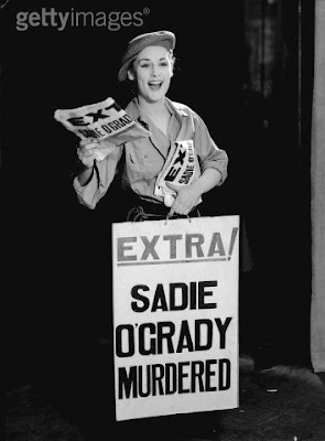
I have been finiding it extremely hard to find a newspaper poster anywhere, I have searched all through the internet and been looking around in towns but have been unsucessful. Thus, I have now focused my efforts on these newspaper posters below that are in the sandwich boards outside off licenses and shops. I have done this as the layout and style of these posters are well recognised and really stand out. I am, therefore, going to mimic this style of design for a poster that is advertising the new release of my college/student newspaper.
This style will hold big bold capitalised text and the newspaper logo. I have not decided as of yet whether I will include a picture, you rarely see pictures on these posters so I doubt I will, as I am going to keep to the conventions as best I can.
Below are a few examples I found off Google Images: